Brand assets
The ViaCara logo, colours and typeface, with files for press and partners to download and a short guide to using each one well.

Who we are
Help people find the professional who can help them, with care, without friction and without changing how that professional works.
Our strapline is "The calmer way to find your support."
Three values shape what we build. Our trust page shows how we keep to them.
-
Understanding before action
We listen first and suggest people second. We pay the same attention to the people who come to us and to the professionals they meet.
-
Privacy by design
We treat what you tell us about your wellbeing as health data from the start. We check our privacy work again when the law changes.
-
Honest by default
We say what we do and how we do it. Rules written by people rank the professionals we suggest.
Our logo
Each mark comes in Via Blue for light grounds and Clarity for dark grounds.
-
Primary logo
Our main logo. Use it first.
-
Logo with strapline
For large moments where the strapline stays easy to read.
-
Brandmark
Where the full logo cannot fit, such as a profile picture.






Clear space and size
Leave space on every side of the logo, as wide as the V in the logo itself. The space grows and shrinks with the logo. In print, keep the primary logo at least 30 mm wide.
Colourways
Use the logo only in these colour pairs.
-
Via Blue on Day Dusk
-
Day Dusk on Via Blue
-
Clarity on Via Blue
-
Midnight on Clarity
-
Clarity on Midnight

Please do not
- stretch, squeeze or warp the logo
- rotate it
- add an outline, a shadow or any other effect
- change its colours outside the pairs above
Our colours
Light themes lead the brand. Twilight and Sundown are highlights, so use them sparingly.
Primary shades
-
Via Blue
Our main colour, first for the logo
- Hex
- #26365A
- RGB
- 38, 54, 90
- CMYK
- 58, 40, 0, 65
-
Day Dusk
Day scenes and light mode
- Hex
- #DAD0FF
- RGB
- 218, 208, 255
- CMYK
- 15, 18, 0, 0
-
Summer Skies
Day scenes and light mode
- Hex
- #C7EBE5
- RGB
- 199, 235, 229
- CMYK
- 15, 0, 3, 8
-
Spring Skies
Day scenes and light mode
- Hex
- #EFF7FA
- RGB
- 239, 247, 250
-
Twilight
A highlight, used sparingly
- Hex
- #7985FF
- RGB
- 121, 133, 255
- CMYK
- 53, 48, 0, 0
-
Sundown
A highlight, used sparingly
- Hex
- #FF4945
- RGB
- 255, 73, 69
- CMYK
- 0, 71, 73, 0
Accessibility shades
These shades keep text and borders easy to see.
-
Midnight
- Hex
- #2B2B2B
- RGB
- 43, 43, 43
- CMYK
- 0, 0, 0, 83
-
Storm
- Hex
- #959595
- RGB
- 149, 149, 149
- CMYK
- 0, 0, 0, 42
-
Overcast
- Hex
- #D5D5D5
- RGB
- 213, 213, 213
-
Clarity
- Hex
- #F9F9F9
- RGB
- 249, 249, 249
- CMYK
- 0, 0, 0, 0
Dark mode
Dark mode sits on a neutral night ground. Day Dusk tones carry the accents, so nothing glows. A faint Day Dusk glow at the top of the page fades into the ground.
-
Night ground
The page in dark mode
- Hex
- #1E1E1E
- RGB
- 30, 30, 30
-
Midnight
Cards
- Hex
- #2B2B2B
- RGB
- 43, 43, 43
-
Night raised
Raised panels
- Hex
- #363636
- RGB
- 54, 54, 54
-
Night border
Borders and dividers
- Hex
- #3A3A3A
- RGB
- 58, 58, 58
-
Dusk tonal
Primary buttons, with #F3EFFF text
- Hex
- #4B437A
- RGB
- 75, 67, 122
-
Dusk light
Links and the pulled-out word
- Hex
- #C9BEF5
- RGB
- 201, 190, 245
-
Dusk focus
The focus ring
- Hex
- #8E84C8
- RGB
- 142, 132, 200
Text pairings
These pairs keep text easy to read.
-
Via Blue on Day Dusk
Contrast 8.22:1
-
Day Dusk on Via Blue
Contrast 8.22:1
-
Clarity on Via Blue
Contrast 11.35:1
-
Via Blue on Spring Skies
Contrast 11.01:1
-
Via Blue on Summer Skies
Contrast 9.35:1
-
Summer Skies on Via Blue
Contrast 9.35:1
-
Midnight on Clarity
Contrast 13.45:1
-
Clarity on Midnight
Contrast 13.45:1
Colour combinations
Start with a priority pair. Use an alternative only to tell two campaigns apart.
-
Brand
Priority -
Event or partner
Priority -
Brand
Alternative -
Event or partner
Alternative -
Event or partner
Alternative
Gradients
Each gradient is a time of day. Use the brand gradient sparingly, to add depth.
-
Brand
Top-level brand work -
Day
Day scenes and light mode -
Dusk
Dusk scenes -
Night
Night scenes
Our typeface
Our typeface is Urbanist. Set text in Urbanist Medium, and the one word you want noticed in Urbanist Bold Italic.
Urbanist Medium
Urbanist Bold Italic
The calmer way to find your support.
Keep headings short. Pull out one word per line at most.
Find the right support.
Underline the one pulled-out word.
It's okay to talk.
Or point to it from above or below with a small arrow.
Over 65 percent
Circle a small figure, never a word.
Use one mark per heading, and leave marks off photographs.
Our photography
Photographs should feel calm, warm and real.
- Bring in a brand colour softly, such as a chair or a wall in Day Dusk or Summer Skies.
- In a portrait, put the colour in the background, or in the clothing when the background feels heavy.
- Keep the grading soft. Avoid harsh colour and hard contrast.
- Never draw marks on a photograph. The type rules still apply.
-
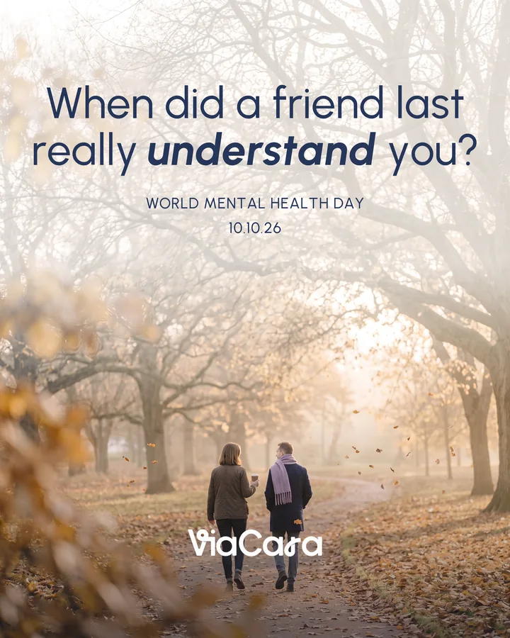
Feed post, 4:5. Soft grading and no marks on the photograph. AI-generated image.
-
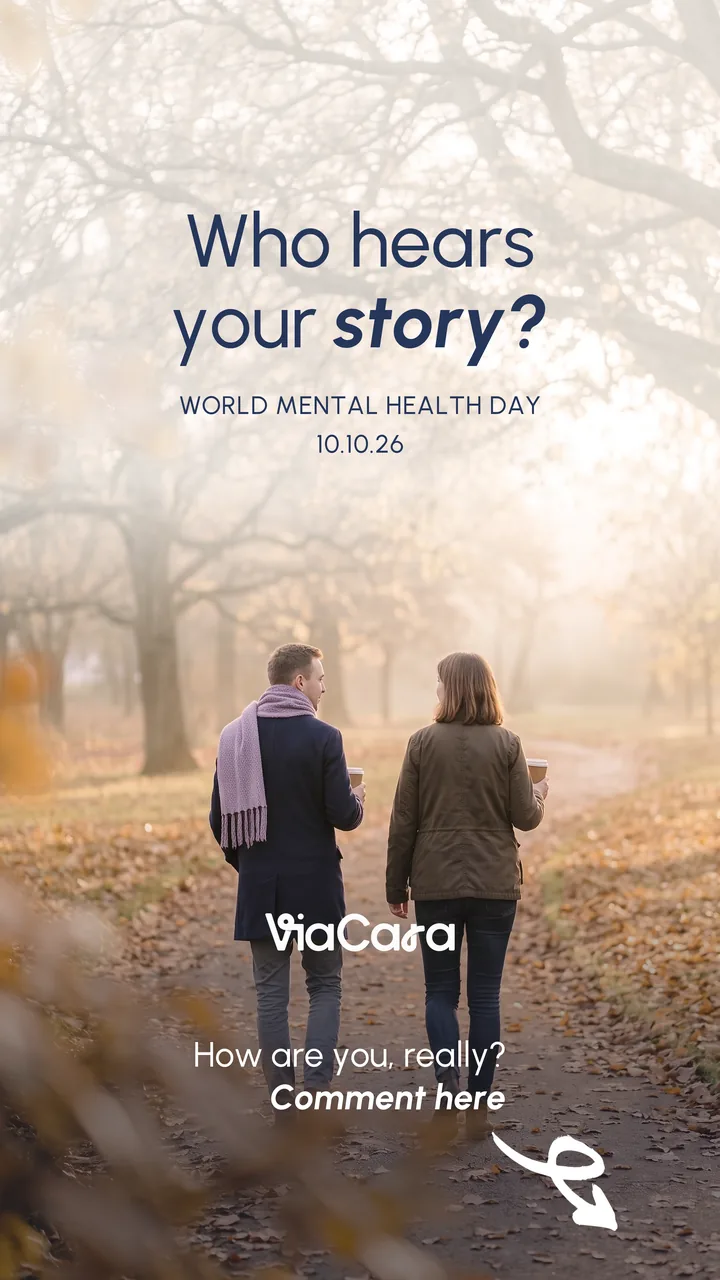
Story, 9:16. Words stay clear of the top and bottom bars. AI-generated image.
Adverts and print
- Size the margins from the longest side of the page, divided by twenty-five.
- Let the headline lead. Its capitals touch the top margin.
- Keep a subheading at half the headline size or smaller.
- Put body copy at the bottom left and the logo at the bottom right.
- On a photograph, lay a soft Clarity wash under the words so they stay easy to read.
-

Top-level brand card on the day sky.
-
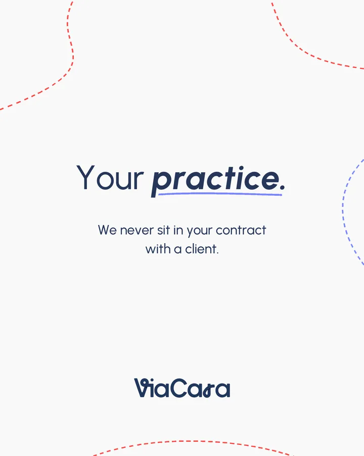
Text card. A dashed frame and one mark on the pulled-out word.
-
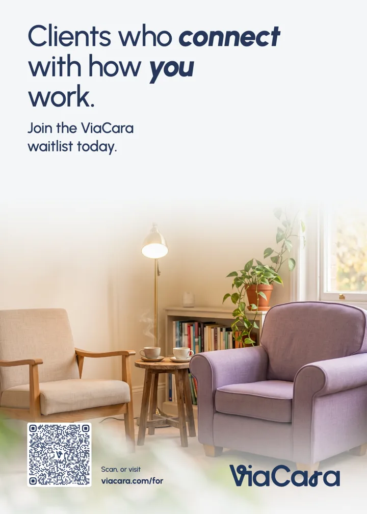
A5 flyer. Headline on the top margin, QR code bottom left, logo bottom right.
Press and partners
For press or partner use, email press@viacara.com.